Disney
Advertising
Project details
How to combine the magical and creative world of Disney with data and numbers.
Disney Advertising is the division of Disney responsible for creating and selling ad space across platforms like Disney+, Hulu, ESPN, and ABC, helping brands connect with their audiences.
Client
Disney advertisign
Year
©
24
Services
Web design. Art director

Design with movement


Why this redesign?
Designing the Disney Advertising website from scratch presented a series of challenges as a UX/UI designer. It involved translating the branding of a globally recognized company into a corporate advertising context without losing its magical and aspirational identity, while also maintaining credibility with various technical, strategic, and creative audiences.
Foundational Research
We explore how Disney transforms abstract concepts into magical experiences—whether in theme parks or advertising campaigns. Inspired by its mastery of storytelling, we aim to build a visual narrative with data, treating it like a ‘story of data.’ As part of our research, we create mind maps that connect iconic Disney elements (like castles, stars, or characters) with data visualization concepts (such as graphs, tables, and timelines), looking for creative ways to bring emotion and clarity to complex information.
Insights
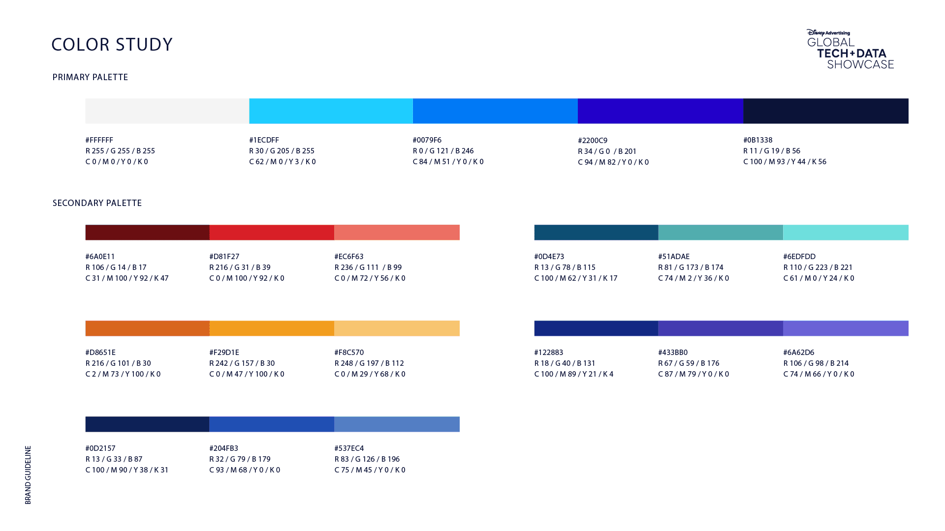
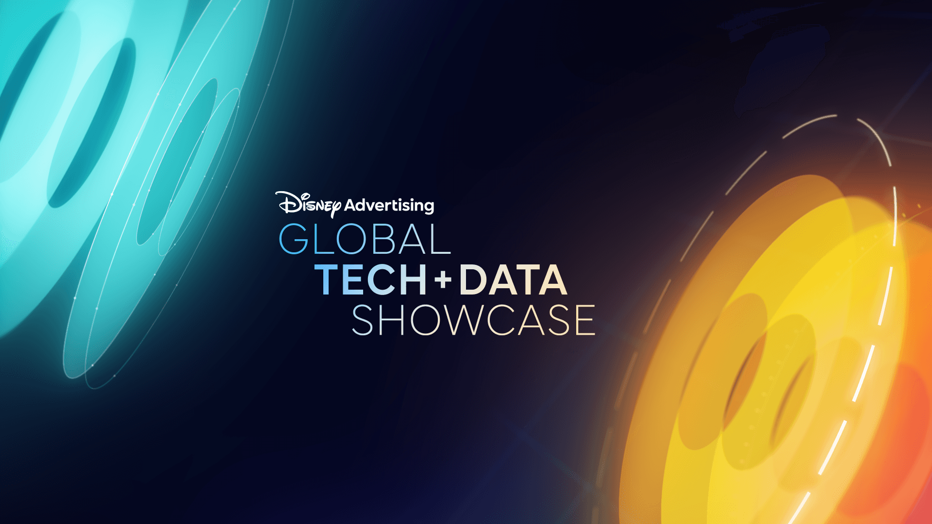
Use iconic Disney colors like sky blue, bright gold and pastel tones.
Soft and magical animations, like numbers that are "drawn" as if it were fairy dust. By hovering the mouse, graphics can be illuminated or show additional details in a playful way.
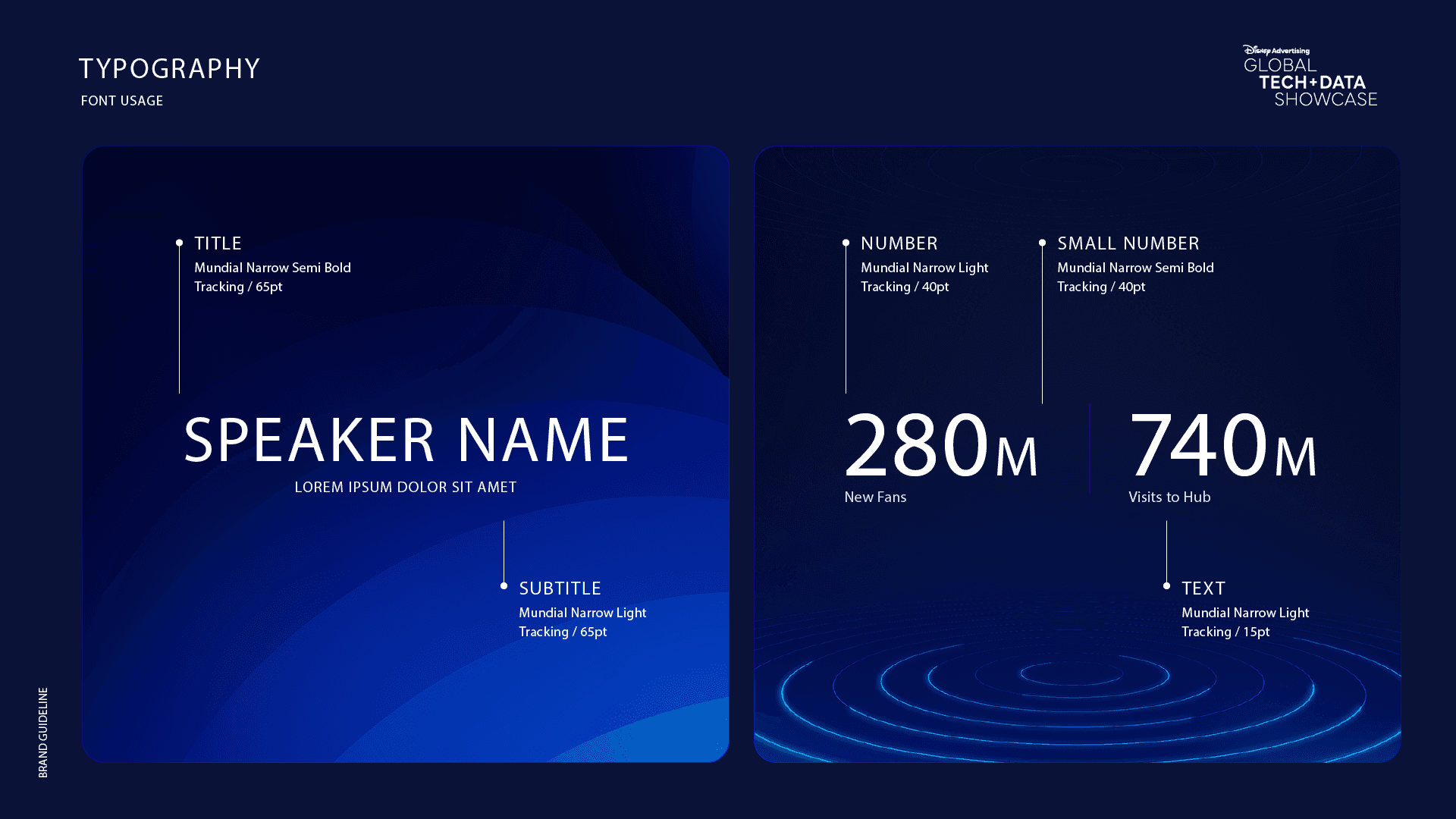
Use a primary font that reflects the brand combined with clear fonts for reading.
With the research complete, we could better define…
What the redesign should be/do:
The new Banco Macro app should be accessible and easy to use, designed for people looking for a modern digital banking experience without sacrificing the security and trust of traditional banking. It should eliminate complexity, optimize authentication and security processes, and offer a superior user experience that competes with digital wallets while strengthening long-term customer relationships.
What the redesig should not be/do:
The redesign should not sacrifice security for convenience, stray too far from the bank's identity, or add features without first solving the fundamental navigation and accessibility issues.
Disneyadvertising redesign achieved:
The new design helped explain Disney’s advertising products in a simple and easy way, making it easier for non-technical users to understand.
The site was organized so different types of users , from advertisers to technical people can find what they need easily and explore more.
The design showed the magic and spirit of Disney in a professional and serious way, keeping the brand strong.Improved key metrics: increases in CSAT and NPS.
Sections were created to show data as a story, like Disney’s storytelling style, helping users understand and interact better with the content.
The design made sure the site loads fast, works smoothly, and is easy to use for everyone on different devices.